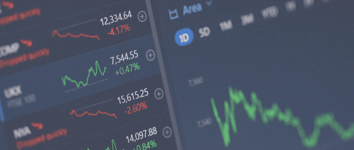
In the intricate world of cryptocurrency trading, charting tools are indispensable for both novice and seasoned traders. They help traders visualise market trends, analyse historical data, and make educated predictions about future movements.
With Kriptomat’s advanced charting tools, you can get a comprehensive view of the crypto market. They equip traders with a suite of features including diverse chart types, a range of time frames and technical indicators.
Whether you’re looking to conduct a quick market overview or an in-depth technical analysis, Kriptomat’s charting tools provide the flexibility and depth needed for informed trading decisions. Let’s see how.
How to access charting tools on Kriptomat?
Accessing charting tools and advanced charts on Kriptomat is easy.
- Log into your Kriptomat account.
- Navigate to the Prices page.
3. Click on the asset for which you want to see the chart.
4. On the top right, you can choose between Simple and Advanced charts. Simple charts plot price movements as a single continuous line giving a clear view of the asset’s overall price trend over time. Advanced charts, on the other hand, represent price movements with candlestick bars which allows for a detailed technical analysis.
5. Click on Advanced to access the advanced chart.
6. Click on the Expand icon to open the chart in full screen (this will open a new browser window).
How to use drawing tools on advanced charts?
Drawing tools are essential for technical analysis. They help in mapping out trends, identifying support and resistance levels, and much more. You can find them in the left toolbar on an advanced chart. Let’s look at how to use some of the most popular drawing tools.
Lines:
- Trend lines: Click on the trend line tool, then click and drag on the chart to draw a line connecting at least two price points. Use this to identify uptrends and downtrends.
- Horizontal lines: These are used to mark specific price levels, often for identifying support and resistance. Select the horizontal line tool and click on the chart where you want to place it.
Fibonacci Retracements:
Select the Fibonacci Retracement tool. Click on a significant low and drag the tool to a significant high (for uptrends), or vice versa for downtrends. This will display key Fibonacci retracement levels, which act as potential support or resistance areas.
Projection Tools:
Projection tools are crucial for planning and forecasting potential trade outcomes. ‘Long Position’ and ‘Short Position’ tools are particularly useful for visualising profit targets and risk management. Here’s how to use them:
Select the Long Position tool located in the left toolbar. It’s designed for planning and visualising potential long (buy) trades. Click on your chart where you plan to enter the trade. Drag the tool upwards to your desired profit target. This will automatically display the potential profit percentage.
The bottom line of the tool, coloured red, represents your stop loss. Adjust it by dragging to the level where you’d exit the trade if it goes against you. This helps in visualising the risk-to-reward ratio.
You can do the same with the Short Position if you’re planning to short (sell) an asset.
Shapes:
Shapes like rectangles or circles can highlight specific areas on a chart. Select a shape from the toolbar and click and drag on the chart to place it. Use this to highlight consolidation zones or significant breakout areas.
Ruler:
The ruler tool helps measure the distance (in price and time) between two points on a chart. Select the ruler tool, click on your starting point, and drag to your endpoint. This is great for measuring the magnitude of price moves or the duration of trends.
How to switch between different types of trading charts?
Trading charts come in various formats, each providing unique insights into market movements. You can switch between the chart type on the top of the chart. Here are the most common types:
Candlestick charts:
Candlestick charts are popular in trading due to their detailed representation of price movements. Each ‘candle’ shows the opening, closing, high, and low prices for a specific time period.
The body of the candle indicates the opening and closing prices, while the wicks show the high and low. Green candles signify a price increase, and red candles indicate a decrease. Traders use various candlestick patterns to predict future price movements.
Bar charts:
Bar charts, similar to candlestick charts, provide information on the opening, closing, high, and low prices. Each bar consists of a vertical line and two short horizontal lines to the left and right.
The top of the vertical line is the high price, and the bottom is the low. The left horizontal line shows the opening price, and the right horizontal line indicates the closing price. Bar charts are useful for identifying the volatility and price range.
Line charts:
Line charts are the simplest type, representing only the closing prices of an asset over time. They are plotted as a single continuous line.
This chart type is excellent for getting a general overview of price trends over a period. It’s less detailed but useful for identifying long-term trends and patterns.
Area Charts:
Area charts are similar to line charts but with the space below the line filled in, emphasising the magnitude of price movements. They are typically used to track cumulative values, like total volume, and are helpful in visualising the overall trend strength and direction.
How to use different time frames?
In trading, different timeframes on charts cater to various trading styles and strategies. You can switch between different timeframes at the top of the chart. Here’s a quick rundown of the common timeframes and who they’re best suited for:
1. Intraday timeframes:
1-Minute to 15-Minute Charts: Ideal for scalpers or high-frequency traders who capitalise on small price movements within a trading day.
30-Minute to 1-Hour Charts: Suitable for day traders who execute trades within a single trading day, focusing on short-term price movements.
2. Short to medium-term timeframes:
4-Hour Charts: Favoured by swing traders looking to capture market movements over a few days or weeks. This timeframe balances detail with a broader view of market trends.
Daily Charts: Used by traders who hold positions for several days to a few weeks. This timeframe provides a clearer picture of longer-term trends and is less impacted by short-term market noise.
3. Long-Term Timeframes:
Weekly and monthly charts: Ideal for position traders and long-term investors. These timeframes are valuable for analysing major market trends and cycles over months or even years. They help in identifying long-term support and resistance levels and overall market sentiment.
Each timeframe provides a different perspective on the market, and traders may use multiple timeframes in conjunction to refine their strategies.
How to use technical indicators?
Kriptomat offers a plethora of technical indicators that are essential for cryptocurrency trading. Understanding and using these indicators can significantly enhance your market analysis and decision-making process. You can overlay your charts with indicators by clicking on Indicators at the top of the chart and then searching for the desired indicator in the search bar. Here’s a quick guide to some of the most common indicators available on Kriptomat:
Moving Averages (MA):
Moving Averages smooth out price data to identify support/resistance levels and trend direction. Learn more about moving averages in our informative article: “How to Use Moving Averages for Crypto Trading”.
Relative Strength Index (RSI):
RSI is a momentum oscillator that measures the speed and change of price movements. It ranges from 0 to 100, with readings over 70 indicating overbought conditions and under 30 indicating oversold. RSI is used to spot potential reversal points or confirm existing trends.
Moving Average Convergence Divergence (MACD):
MACD Consists of two moving averages (the MACD line and the signal line) and a histogram. Crossovers between the MACD and signal lines indicate potential buy/sell signals. The histogram shows the difference between the two lines. MACD is used for identifying momentum shifts and potential entry/exit points.
Bollinger Bands:
Bollinger Bands is a volatility indicator consisting of a middle SMA and two standard deviation lines. Look for price squeezing between the bands (low volatility) or widening (high volatility). Prices touching the upper/lower bands can indicate overbought/oversold conditions. Bollinger Bands are used for breakout strategies and volatility assessment.Dive deep into technical indicators with our comprehensive guide: “What Are the Most Popular Technical Indicators in Crypto Trading?”
To sum up:
Kriptomat’s charting tools offer a comprehensive suite of functionalities that are essential for any crypto trader. We encourage you to spend time practising with these tools. Familiarising yourself with their capabilities can significantly enhance your trading effectiveness and confidence.
Additionally, delve into the educational content available on Kriptomat for more insights and strategies. And if you haven’t already, consider signing up for Kriptomat to access these powerful tools and start applying your newfound knowledge in the real world of crypto trading. Your journey towards becoming a more informed and skilled crypto trader begins here.
NOTE
This text is informative in nature and should not be considered an investment recommendation. It does not express the personal opinion of the author or service. Any investment or trading is risky, and past returns are not a guarantee of future returns. Risk only assets that you are willing to lose.


 IOS
IOS Android